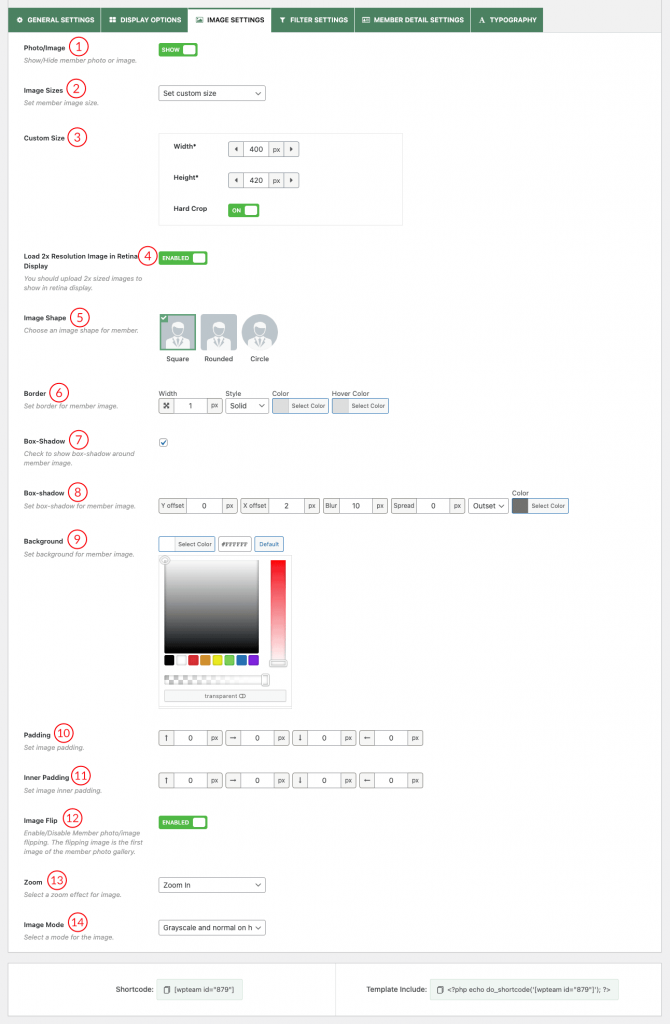
(1) Photo/Image: Show/Hide member Photo or Image.
(2) Image Sizes: Set a member Image Size.
(3) Custom Size: You are allowed to set custom width and height for Member Photo or Image.
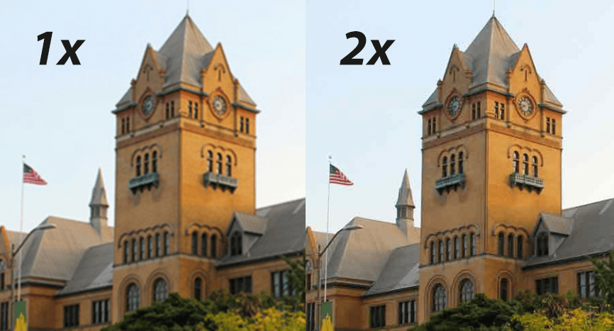
(4) Load 2x Resolution Image in Retina Display: 2x images are scaled-up and optimized for Retina/HiDPI screens. They’re scaled to twice the size of 1x images, but since retina screens have twice the pixel ratio of most other screens, they output the same size visually as 1x.
If the jpg image is 1x, it can look “fuzzy” or “pixelated” on higher DPI screens. Here is an example:
(5) Image Shape: Choose an image shape for a member photo. Available options are square, rounded, and circle.
(6) Border: Set the border width, style, color, and hover color.
(7) Box-Shadow: Check the box to show the box-shadow around the member image.
(8) Box-Shadow: Set the box-shadow style from here.
(9) Background: Set image background color.
(10) Padding: Set image padding as you like.
(11) Inner-Padding: Set image inner-padding. The default value is 0px.
(12) Image Flip: Enable the option to flip member photos on hover. The flipping image is the first image of the member photo gallery.
(13) Zoom: This option allows you to move your mouse over a product and instantly magnify it without clicking or opening anything. Available options are:
- Off
- Zoom In
- Zoom Out
(14) Image Mode: Set an image mode from here. There are 4 Options:
- Normal: No grayscale effect.
- Gray and normal on hover: The logo image becomes gray, but when you hover the image color becomes normal.
- Gray on hover: When you hover a logo the image will turn gray.
- Always gray: The logo images will be gray all the time.
