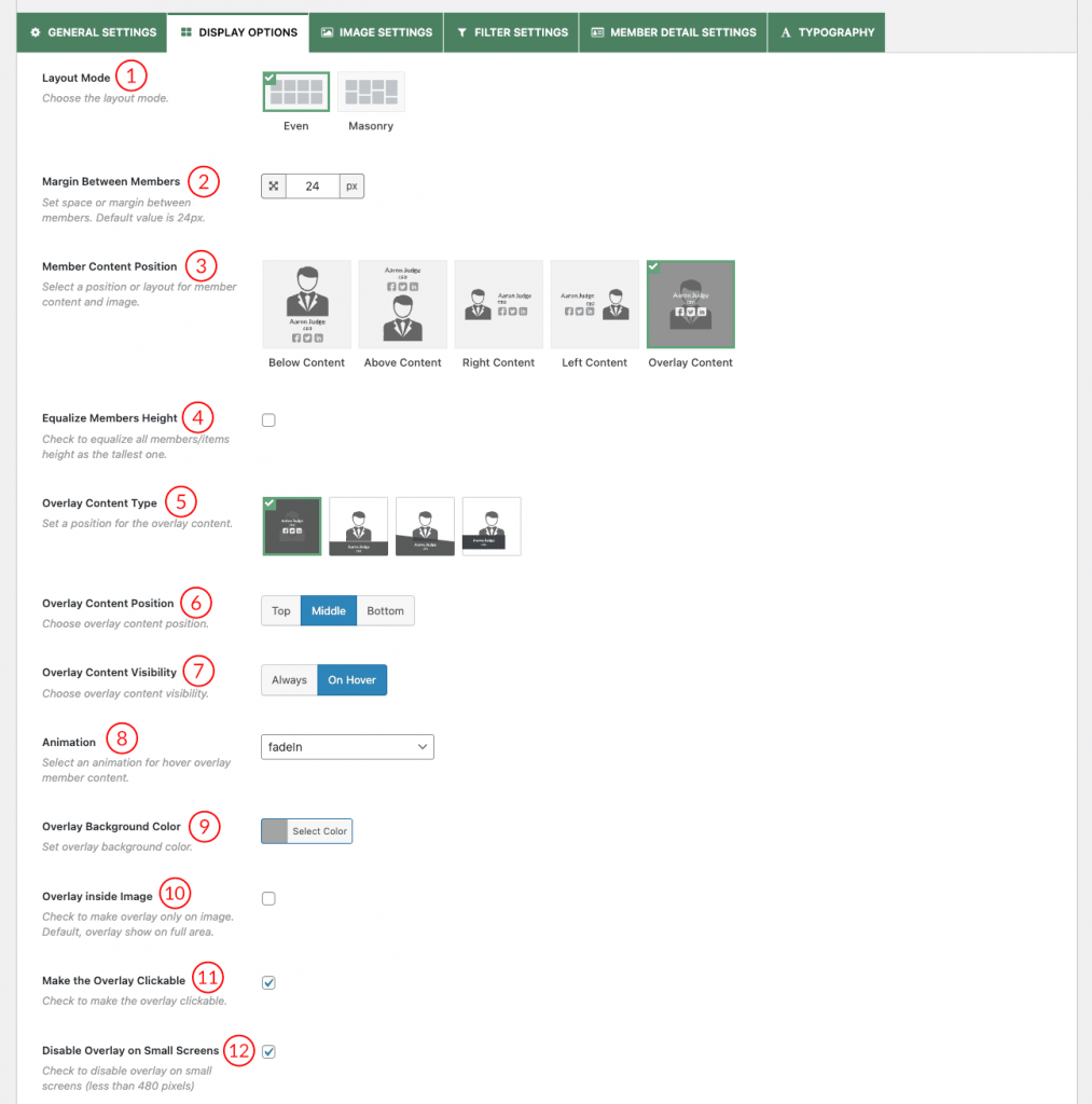
(1) Layout Mode: When the Layout preset is selected as Grid, you will find the option to choose layout modes in the Display options.
(2) Margin Between Members: Set a space/margin between members in the layout presets. The default value is 24px.
(3) Member Content Position: Select a position for member content and image. There are five different positions available.
a. Below Content
b. Above Content

c. Right Content

d. Left Content

e. Overlay Content

(4) Equalize Members Height: Check the box to make all members/items the same height as the tallest one.
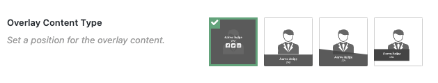
(5) Overlay Content Type: You can showcase member information on an overlay in four ways.
(6) Overlay Content Position: Choose an overlay content position from the Top, Middle, and Bottom.
(7) Overlay Content Visibility: Choose an overlay content visibility option from here.
(8) Animation: Select animation for overlay member content on hover.
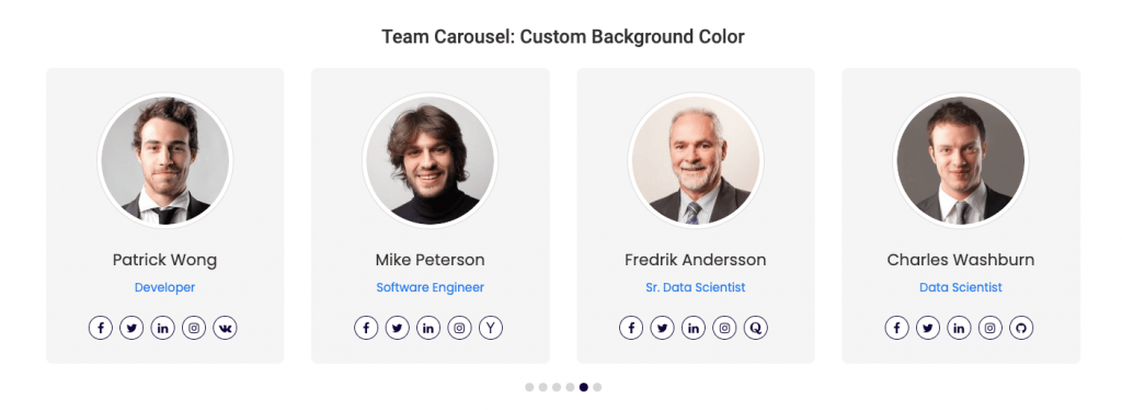
(9) Overlay Background Color: Set the Overlay Background Color from here.
(10) Overlay Inside Image: Check to make an overlay only on the image. The default overlay is shown on the full area.
(11) Make the Overlay Clickable: Check the box to make the overlay clickable.
(12) Disable Overlay on Small Screen: Check the box to disable an overlay on small screens (less than 480 pixels).
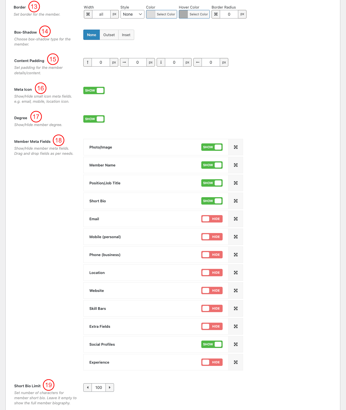
(13) Border: Set border, Style, Color, and Hover Color around the member.
(14) Border Radius: Set Border Radius for the member.
(15) Box-Shadow: Check the box to show the box-shadow around the member.
(16) Content Padding: Set padding for the member content.
(17) Meta Icon: Show or hide the meta icon (e.g., email, mobile, location icon) from here.
(18) Member Meta Fields: Show or Hide Member meta fields. Order them by doing drag and drop.
(19) Short Bio Limit: Set the number of characters to show in the member’s short bio.
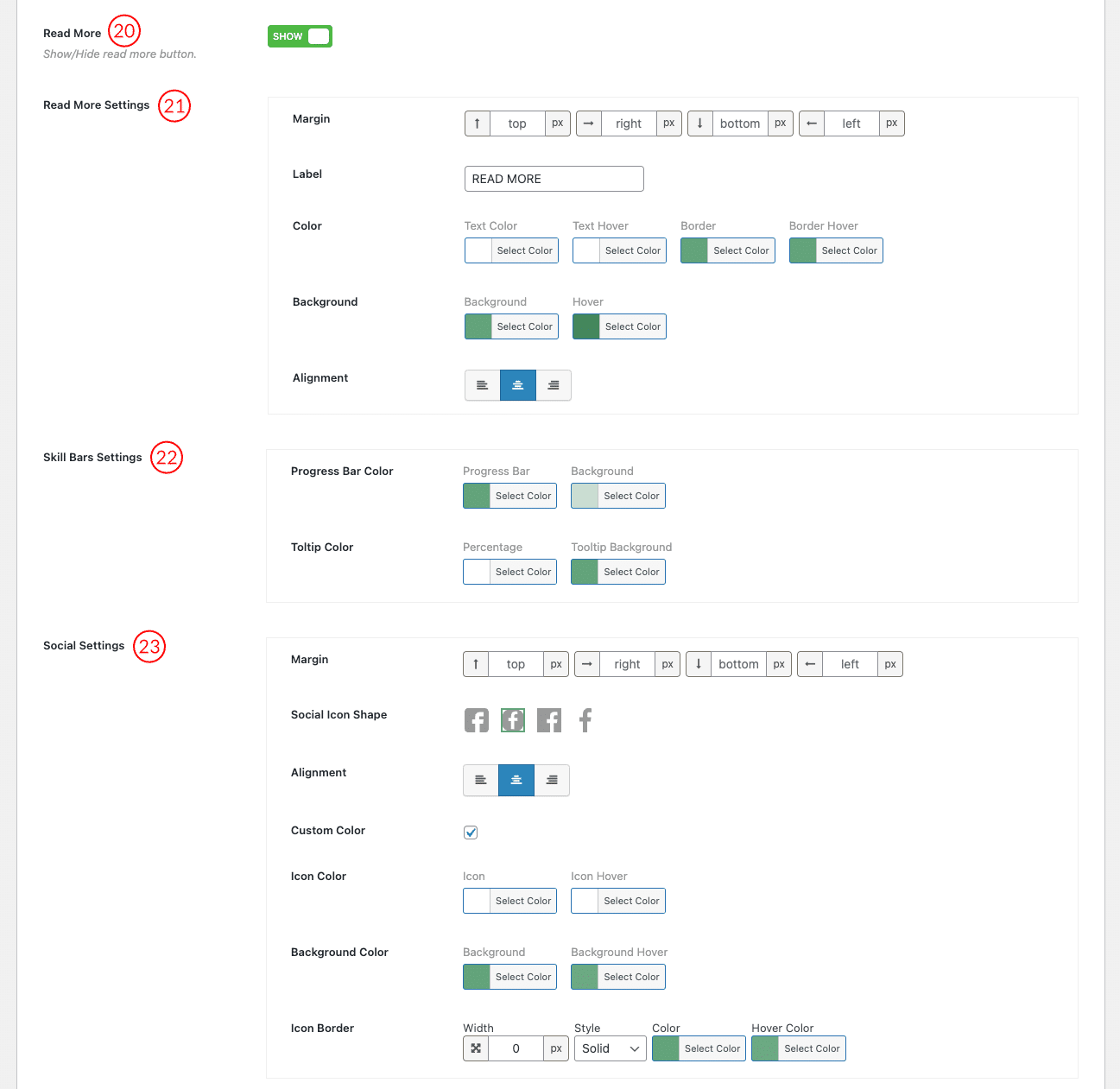
(20) Read More: Show or Hide a Read More Button after Member Short bio.
(21) Read More Settings: Configure Read More Margin, Label, Color, Background, and Alignment from here.
(22) Skill Bars Settings: Configure the progress bar and tooltip colors from here.
(23) Social Settings: Set Margin, Social Icon Shape, Alignment, and Custom Color from here.
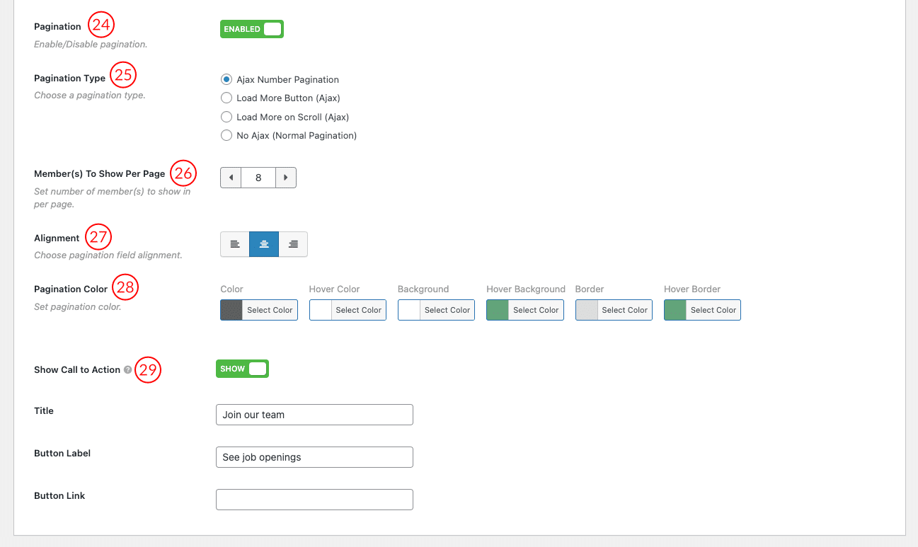
(24) Pagination: Enable or Disable pagination.
(25) Pagination Type: Choose a pagination type. Available options are
- Ajax Number Pagination
- Load More Button (Ajax)
- Load More on Scroll (Ajax)
- No Ajax (Normal Pagination)
(26) Member(s) to Show Per Page: Set the number of member(s) to show per page.
(27) Alignment: Choose an alignment for the pagination field.
(28) Pagination Color: Set Pagination Color, Hover Color, Background, Hover Background, Border, and Hover Border Color.
(29) Show Call To Action: Show or Hide Call to Action Button, which will display underneath the layout preset. You can use it to display Job Openings. Configure the Button related properties like Title, Button Label, and Button Link.
