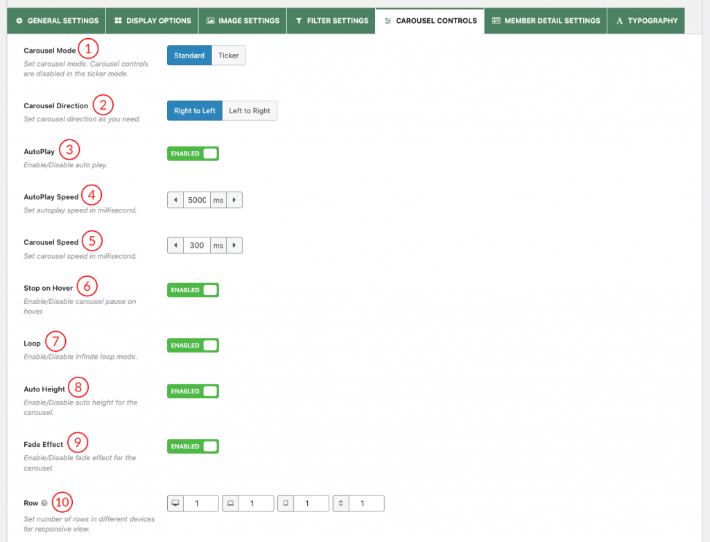
(1) Carousel Mode: Choose your expected carousel mode. The following three carousel modes are available to present your Team Members.
- Standard: It is the standard and default carousel mode to showcase the members in a sliding manner. If you choose this carousel mode, you will get an output like the following demo-

- Ticker: Ticker is another stylish carousel mode. In this mode, the carousel slider is continuous without any intervals. If you choose this carousel mode, you will get an output like the following demo-

(2) Carousel Direction: Select a carousel mode according to your website. Available directions are-
- Right to Left (RTL)
- Left to Right (LTR)
(3) AutoPlay: Turn on or off the autoplay option. If you turn on this option, it will allow the carousel to start playing once the page is loaded. By default, it is turned on.
(4) AutoPlay Speed: If you turn on the autoplay option, you will get this option to set the autoplay speed. The unit is in a millisecond. The default value is 5000 ms.
(5) Carousel Speed: Set the carousel speed. The unit is in a millisecond. The default value is 300 ms.
(6) Stop on Hover: Turn on or off this option. If you turn on this option, it will stop the carousel from playing once users hover over the carousel. By default, this option is turned on.
(7) Loop: Loop allows you to navigate the carousel items continuously without moving backward at the end of the carousel items. You can turn this on or off this feature. By default, this option is turned on.
(8) Auto Height: Enable this option to dynamically adjust the WP Team carousel height based on each slide’s height.
(9)Fade Effect: Enable the option to slide the member through the fade effect.
(10) Row: Set the number of carousel rows for responsive devices. Using this option, you can create a multi-row carousel.
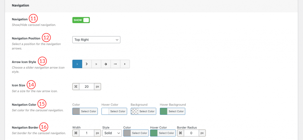
(11) Navigation: Navigation helps users move from one member to another. You can also turn off the option from here.
(12) Navigation position: Select a Position for the Navigation Arrows. Available Options are
- Top right
- Top center
- Top left
- Bottom Left
- Bottom center
- Bottom right
- Vertically center inner
- Vertically center inner on hover
(13) Arrow Icon Style: Select an arrow icon from 6 different icon styles.
(14) Icon Size: Increase or decrease the navigation arrow icon size.
(15) Navigation Color: You can style the carousel navigation using the following available style options-
- Color
- Hover Color
- Background
- Hover Background
(16) Navigation Border: Configure border, border styles, and Border Radius for the carousel navigation as you wish. The default value is 1px.
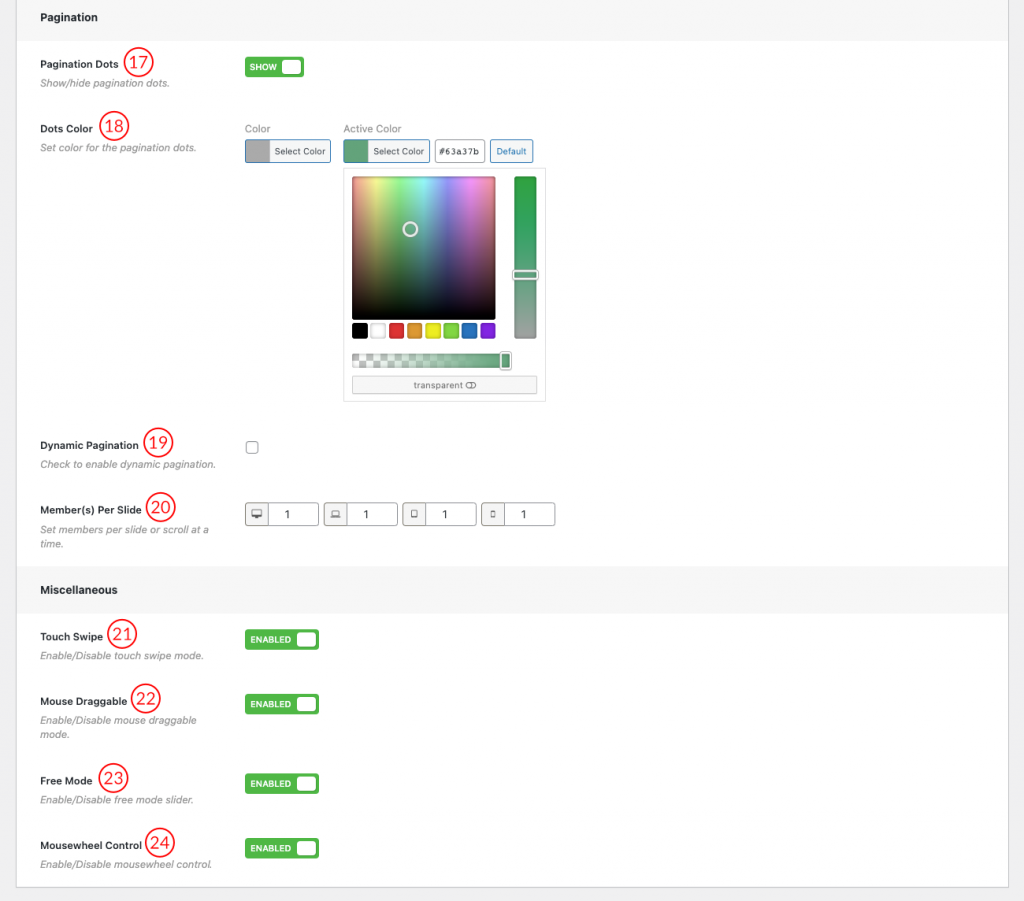
(17) Pagination Dots: Either show or hide the carousel pagination. If you show the carousel pagination, you will get some extra options.
(18) Dots Color: Set the color for the carousel pagination dots. You can also set an active pagination dot color.
(19) Dynamic Pagination: Check if you want to show the pagination dynamically.
(20) Member(s) Per Slide: Set members per slide or scroll at a time.
(21) Touch Swipe: Swiping in touch is the act of quick-shifting your finger throughout the touch surface in a certain direction. This feature will be available in the slider after keeping this option ON.
(22) Mouse Draggable: Turn On or Off mouse draggable mode. If you turn it on, it allows you to navigate the carousel items with dragging.
(23) Free Mode: Enable or Disable the slider free mode from here.
(24) Mousewheel Control: Turn On or Off the Mousewheel Control mode to slide the carousel on the left or right.
